On App Inventor: Speaking the Language of Novices
Posted 16 August 2010
Google’s App Inventor is a great idea. Empowering consumers to create is always a good thing. Visual Basic was the key to Microsoft’s long-time success. Map making tools are the reason why Warcraft III and Starcraft still sell on retail shelves, more than a decade after their release. iMovie, Windows Movie Maker and its counterparts have helped make YouTube the site for almost every Web meme of the last five years.
Visually-oriented IDEs are a great way to develop software quickly. Visual Basic and Delphi are two classic examples of this, and their tradition of partial WYSIWYG views carries on to Visual Studio and Flex Builder today. (I’ve also made the argument that if Adobe wants CFBuilder extensions to really take off, they need a visual UI to create them.) They’ve even evolved to have a similar visual language: panels spread out on the screen which allow for inter-panel communication and interaction, playing off visual and interaction patterns common to many IDEs. When you fire up Eclipse or Visual Studio, you, as a programmer, can say “Oh, I know the basics of how this IDE works because it looks like other IDEs I’ve worked with.”
All of those tools, however, expect that the user has some kind of fundamental understanding of the basics of programming: simple data structures, simple logic controllers, and so on. You simply can’t get by without them.
Now let me say that I’ve had minimal direct experience with Google’s App Inventor. I don’t think that’s a problem here because I want to talk about first impressions, as those mean a lot to the average, non-technical user at whom Google is targeting the product.
Take a look at this screenshot from the product’s home page:
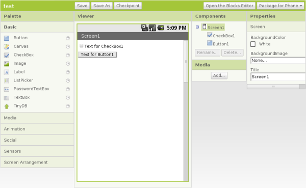
The focus of the UI is on the simulated phone screen in the middle of the window, as it should be. Take a look at the list of controls under “Palette,” on the left. There you’ll see titles for controls such as “Canvas,” “ListPicker,” and “TinyDB.” Although there is a question mark next to each which, when clicked, tells the user what the control is, that text (and other text on the screen) is very much the language of the programmer and not the user. A non-technical, non-programmer, average, everyday Android phone user (who is the target user of App Inventor) would probably look at that and say “What the heck is a ListPicker?” I’ve worked with a lot of “non-technical, non-programmer users,” and know pretty well that when any “programmer-ese” comes in to play in the UI, users tend to be taken aback and almost immediately take a combative approach to this UI written in a language other than their own.
This programmer-centric language works its way in to other elements in very subtle ways. Look at the properties you can manipulate in the “Components” and “Properties” panels. The text which describes the properties you can manipulate, while clear, is written in camel case — a programmer’s, not average user’s, convention. “CheckBox1” could just as easily have been displayed as “Check Box 1.” The same goes for “BackgroundColor” and “BackgroundImage.” I know this sounds trivial, but it’s clearly the work of programmers who expect that users will get or, at least, grow accustomed to the way software is written by programmers, not “average end users.”
I also have to wonder if the basic assumption of the standard IDE UI as the default UI is an appropriate one. In my experience, users are task-focused. They want to be able to make a movie from video on their camera and upload it to YouTube. They want to write a letter to their congressman about an issue that is important to them. They want to set up a quiz for the students in their class to take. As users are task-focused (and not document focused), an application should start with smart defaults and help a user accomplish basic tasks quickly. Instead of showing the standard IDE UI at startup, App Inventor may be better served with a “Start Screen” which could ask:
What kind of application would you like to build?
- One that uses data from my Twitter account.
- One that uses maps to display places that are important to me.
- One that lets me chat with my friends.
- None of the above.
The options presented here, when selected, would then pull together some of the basics for the application, saving the “average user” quite a bit of time and lay out most of hte plumbing required to get their desired application off the ground. This “Start Screen” could be turned off in the application’s preferences for user who don’t want to be bothered with this kind of getting started page.
The blocks tool that the team has devised to map out the internal logic of the application is really smart. It makes visualizing the logic clear and it’s easy to drag and drop components in to the right order. No-code development environments like this are key to getting “average users” to use the tool to create applications that do what they want.
I’ve used “average users” in quotation marks throughout this entry. That’s because I don’t think the real audience is “average users” — meaning someone who owns a smartphone but hasn’t developed software before. The tool was developed by university-level faculty and targeted towards students at various levels (elementary, middle, high and university) but in the context of teaching software development. As such, I believe the tool makes the fundamental assumption that you have to have some knowledge of the art of programming. That assumption informs the design of the UI and how users interact with it. It makes it vastly simpler for individuals to develop applications (even me!), but it’s not a tool that can be used by just anyone with experience with smartphones.
App Inventor was created by a lot of people much smarter than I. It’s also still in beta and something I know that the team will improve upon over time. I just have to point out that if they really want to create something which allows the average user of a cell phone to build their own applications, they need to create a UI that, from start to end, reads in the way that an average, non-programmer user would understand.